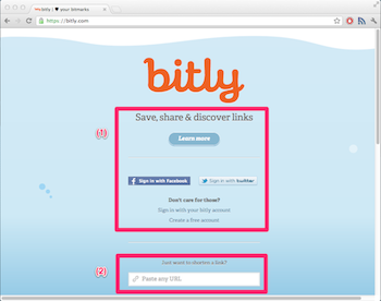
Bitly has a new user design:

The new design is cleaner and mobile friendly, however I’m not that satisfied with its usability. The purpose of services like bitly is to provide an easy way for users to shorten their URLs. If you check the new design, the first thing you come across is a login “dialog” (1) and the real deal (2) is hidden somewhere down. Just to make things harder, there is no input focus, so I have to scroll down and click in the textfield in order to use the service. It seems that the new design puts more emphasis on the social context than on the primary purpose of the site. But it wasn’t always like this. Have a look at the old design:

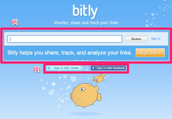
This also looks fine, and the real functionality, i.e. shortening URLs (1) is in the middle - with input focus - and the login is somewhere down (2). This is a better approach in my opinion.
According to different sources (here and here), bitly and other URL shortener companies’ business models share two pillars of functionality: providing service for other companies and providing statistical information on certain sites: the more frequent an URL is shortened the more popular it is. This method is claimed to be faster and more accurate than Google’s page rank. Actually, this is a very good idea.
I’m not an expert, but both of the pillars require me to use the service as easily as possible and for free. The service is still free, but I don’t understand why the sudden movement towards socializing at the expense of the usability. Maybe the reason is that Bitly recently raised 20 million USD in new funding, which nowadays means that it should be social.
The official bitly blog has several good posts about the new features and services, and it seems that the rest of bitly is doing fine, the only casualty is the web interface. Unfortunately, I didn’t manage to find anything that really explains the change in the design. If you know something, don’t hesitate to share.
comments powered by Disqus